Crumbling, confusing Food Pyramid replaced by a Plate
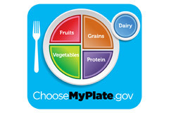
The crumbling Food Pyramid and its hip successor (MyPyramid) fell into oblivion yesterday, eroded by the stinging winds of science. Their replacement? A quartered plate called—wait for it—MyPlate that was designed to visually convey the elements of healthy eating to Americans of all ages.
The new icon consists of a white plate divided into four segments: green for vegetables, red for fruits, orange for grains, and purple for protein. Dairy has a prominent place, sitting where a glass of water should be. The hope is that the plate will nudge Americans away from meals dominated by meat and starch and towards meals made up mostly of plant-based foods.
The original Food Guide Pyramid debuted in 1992. It was built on shaky scientific ground. Over the next few years, research from around the world chipped away at the healthy eating message in the pyramid’s base (refined carbohydrates), the middle (meat and milk), and the tip (fats).
The Pyramid got an extreme makeover in 2005. To create MyPyramid, it was flipped on its side (so no food type was on the bottom, and perceived as “worse”), painted rainbow colors, was given a stick figure sprinting up its side, and stripped of any useful information. The million-dollar makeover was a step backward.
MyPlate, by comparison, is a good move. It offers information on portion sizes and sends the message that a balanced meal should be at least half vegetables and fruits.
“Clearly MyPlate will be better than MyPyramid,” nutrition expert Walter C. Willett told The Nutrition Source. “But the most important issues are in the details that are not captured by the icon. What type of grain? What sources of proteins? What fats are used to prepare the vegetables and the grains?” Willett, who chairs the department of nutrition at the Harvard School of Public Health, has been a long-time critic of the Food Pyramid. His best-selling book, Eat, Drink, and Be Healthy: The Harvard Medical School Guide to Healthy Eating, details how and why the old pyramids actually contribute to unhealthy eating. (Full disclosure—I co-wrote the book.) Willett’s Healthy Eating Pyramid is based on up-to-date nutrition science.
MyPlate doesn’t show that whole grains are better for you than refined, rapidly digested grains, or that fish and beans are better protein choices than red meat. It doesn’t give any guidance that eating more unsaturated and omega-3 fats is good for health, as is cutting back on saturated fats from meat and dairy.
One thing missing from the place mat is a garbage or compost can for the sugary baked goods, breakfast cereals, and drinks, and the salty processed foods and snacks, that make up a big chunk of the average American’s daily caloric intake.
Although the USDA is trying to make MyPlate sound new. It isn’t. The New American Plate, which the American Institute for Cancer Research developed in 1999, uses an almost identical plate icon to encourage people to eat more vegetables, fruits, and whole grains. In the United Kingdom, the Eatwell Plate has served as a pictorial guide to healthy eating.
In spite of their shortcomings, the latest Dietary Guidelines for Americans and MyPlate are better than their prior versions. MyPlate is worth teaching in schools and printing on cereal boxes. Whether this will help stem Americans’ frightful eating habits is anyone’s guess.
About the Author

Patrick J. Skerrett, Former Executive Editor, Harvard Health Publishing
Disclaimer:
As a service to our readers, Harvard Health Publishing provides access to our library of archived content. Please note the date of last review or update on all articles.
No content on this site, regardless of date, should ever be used as a substitute for direct medical advice from your doctor or other qualified clinician.


